
Julie’s Noodles
Redesigning the menu for the best soup dumplings in Austin, Texas
Tools
Figma, Adobe Illutator
Context
School assignment - Solo project - 2023
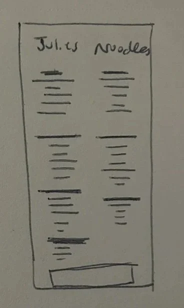
PROBLEMJulie’s has an outdated menu
Hard to read
Poor contrast
Visually unappealing
Poor hierarchy

GOALSTake what works & leave the rest
Reorganize menu
Keep traditional Chinese elements
Use logo and restaurant for inspiration
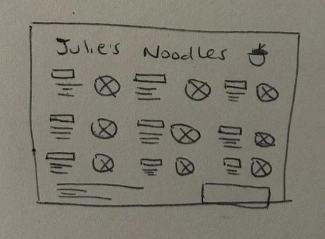
SOLUTION
Re-designed Menu
Separate Mandarin and English menu (front/back)
Traditional Chinese elements
New modern graphics
Clear hierarchy
The Process
INSPIRATIONRestaurant Interior & Original Menu

Maroon and cream color scheme
Traditional Chinese elements
Wood-carved texture
Iconography (i.e., lanterns, dragons, clouds, etc.)
Emphasis on horizontal composure
Basis for color scheme
Animation style for new graphics
Existing logo
IDEATIONMood board

Aerial view or graphics of foods- creates appealing visuals and portion expectations
Modernization in the direction of the existing logo
DESIGN CONCEPTS


What didn’t work & why
Simple or minimalistic designs. Julie’s menu offers a large number of food options.
Vertical layout. Vertical layout does not align with traditional Chinese design.
Use of pictures for each menu item. With so many menu options, including pictures for each item, the design would become crowded and busy.
What did work
Modernizing without sacrificing brand identity
Lantern and noodle iconography in the style of the existing logo
Border elements with a traditional Chinese “wood-carved” feel
Lighter background for a fresher, brighter menu while maintaining the same color scheme
Layout and Hierarchy
Cleaner and more readable
More effective in quickly locating items
Final Design
Reflection
Future Steps
The timeframe for this project was about 1 week. With more time, I’d love to do the following:
Try out a textured background with Chinese cloud graphics
Improve spacing
More red incorporation
Test different font combinations
Got Feedback? Let me know!
I welcome all critique and criticism about my designs. There’s always room for growth. Use my anonymous submission box for any feedback you may have.